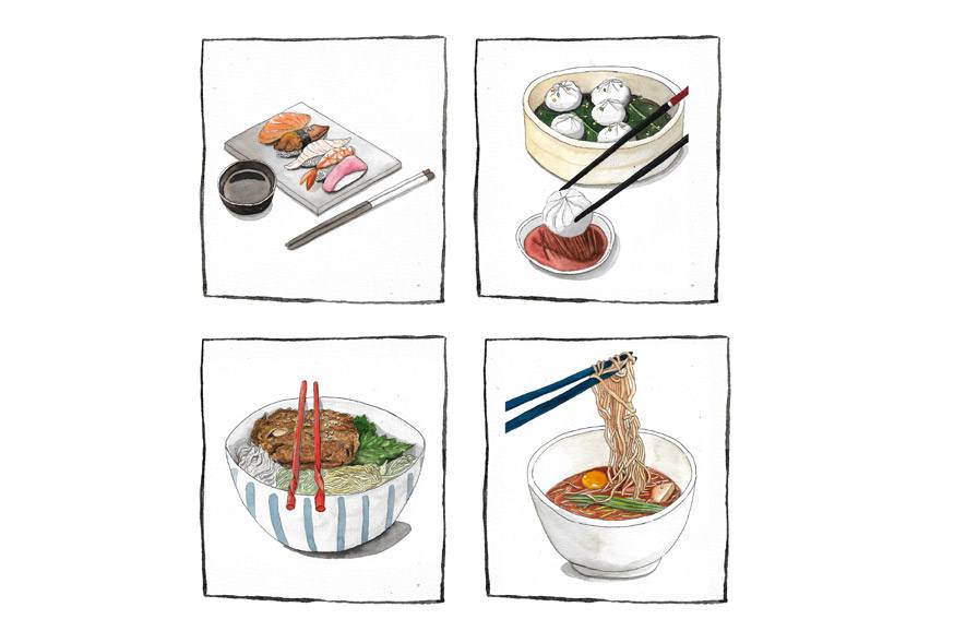
Menaka, my best friend of twenty years, and I have an unspoken ritual every time we eat out. She opens the menu, momentarily flits through it — with what I imagine is mounting panic — and hastily hands it back to me. “You order,” she says, and I comply. Her discomfort at the tantalising possibilities contained within the pages of a menu always puzzled me until I began to notice that she was far from the only person who was intimidated by the gilded gateway ― or confusing rabbit hole, depending on how you perceive it — that leads to the Promised Feast.
You see, menus dwell precisely in the intersection between our innate desire for choice, and our confusion when faced with too many choices. When you think about it, most menus are like buffets: dazzling the eye with an embarrassment of plenty, in the hope that you may overlook the fact that the word ‘salad’ is often wilted. Obscured by fripperies that are as futile as iceberg lettuce — apologies, lovers of crunchy water — menus, like meals, are often in dire need of a keen editor who can trim the flabby excess, and make every mouthful matter.
Although there is something to be said about the poetic simplicity of restaurants that exhibit their wares on a chalkboard, I would be remiss if I implied that menus are redundant. The real alchemy may happen in a restaurant kitchen, but there is as much artistry involved in enticing diners to push the boundaries of their palates, and take a chance on an ingredient or technique they have never heard of. Put simply, a few pithy lines on a page can be the transcendental bridge between you and that blood sausage you swore you’d never try.
The sheer breadth of possibilities makes me wonder — with renewed confusion — why menus so often seem divided by a yawning chasm. On the one hand, you have menus that require you to bring a Larousse to your dinner date just to tell a jus from a roux (and avoid seeming basic). On the other, you have those that seem to espouse a kind of culinary Morse code, where dishes are distilled down to their constituent — and often exotic — ingredients, separated by dots and dashes. This approach works wonderfully well when you are serving tomato soup, but when it comes to virtually anything else, it acts as an obstacle course instead of an enticement.
Does this mean that menus are meant for the exclusive consumption of the worldly, who can effortlessly glide between multisyllabic words without losing their footing? Shouldn’t they be more welcoming, luring us in not just with the provenance of the sun-ripened tomato but also with its transformative ability to nourish our yearning for warm comfort? How many words are too many words, and how few adjectives should be allowed?
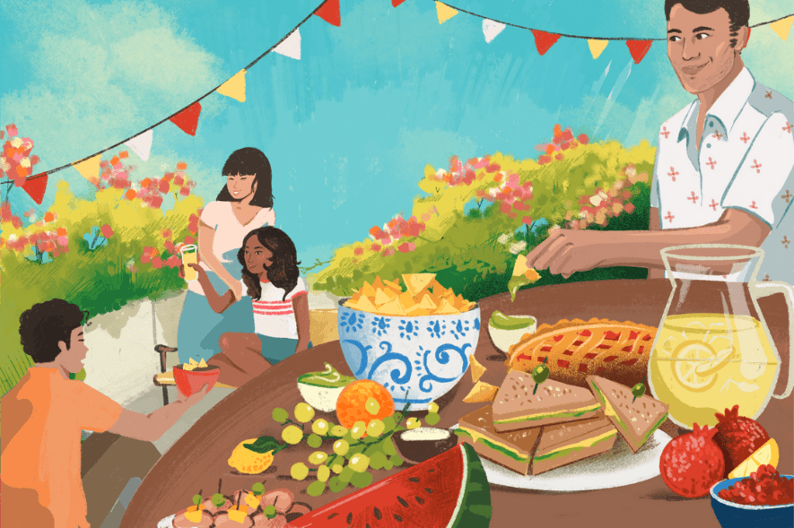
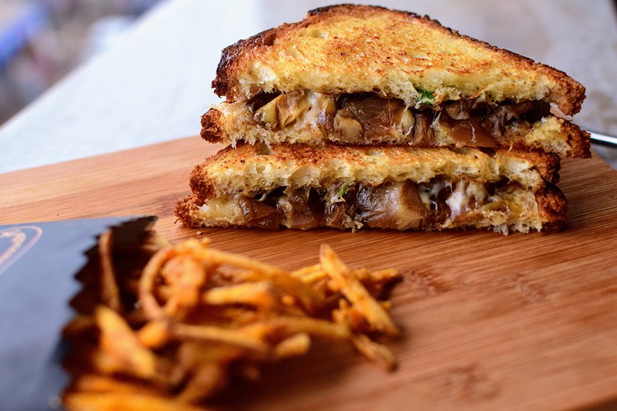
These are all existential questions that reinforce my belief that menu design and philosophy often share a lot in common. It doesn’t make the choice any easier. But if it’s any consolation, there is another method that completely eschews the need to wrestle with words at all. Simply keep a keen eye out on the plate that looks most appetising — after all, we do eat with our eyes first — and without shame or censure, point to it and say confidently: “I’ll have what she’s having.”
Vidya Balachander is an Indian food and travel journalist, based in Colombo, Sri Lanka. Formerly the features editor of the Indian edition of BBC Good Food, her writing has appeared in publications such as Saveur, CNN’s Parts Unknown, NPR’s The Salt, Roads & Kingdoms, National Geographic Traveller and others. At present, she also serves as the editor-in-chief of Roar LK, a Colombo-based features web magazine. She tweets and Instagrams at @vidya83.
Tell us what you think? Drop us a line.

