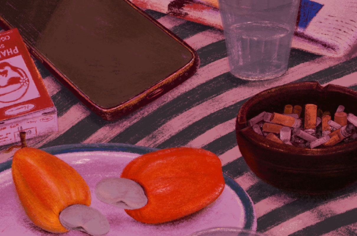
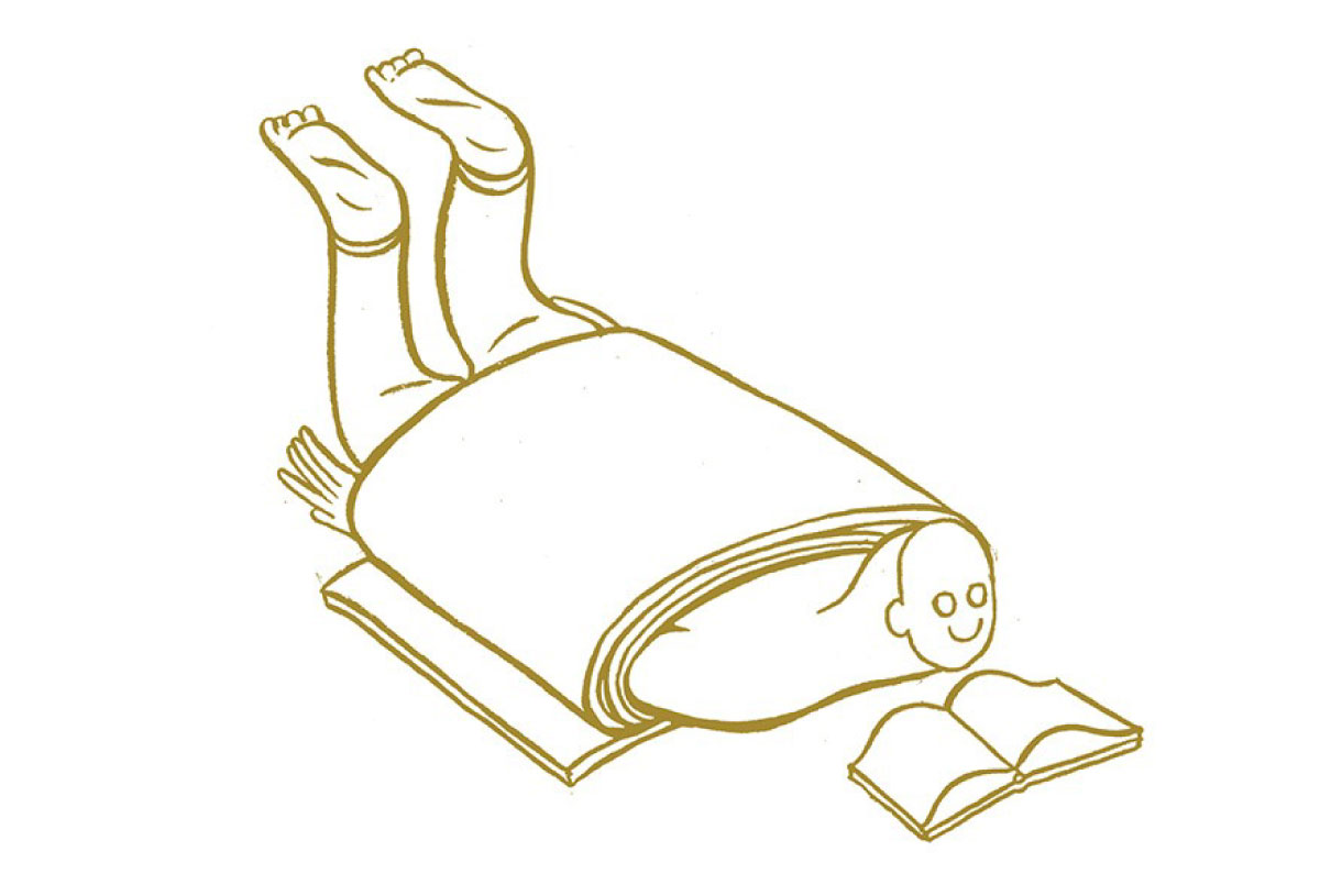
What are you currently reading? Is there a work of writing you frequently revisit?
In recent years, my reading has been hijacked by non-fiction, and it’s a slippery well I can’t seem to climb out of. What’s on my shelf won’t inspire readers but honesty demands that I mention Yuvah Noel Harari’s Sapiens and Rory Sutherland’s Alchemy. The latter is a popular contrarian thinker on marketing. Nicholas Nassim Taleb, a pop-philosopher with original, important ideas — even if you have to put up with his smartest-guy-in-the-room brand of invective — has been, and is, in the pile on my bedside. These two plug each other quite a bit. Rory is plain fun and too Brit-laddish to be vain. Another thread is on human physiology, through the lens of health, anthropology and evolution. All of these bear re-reading (Stephen Jay Gould, Matt Ridley among others).
Quite a bit of my non-fiction reading nowadays is on subjects adjacent to my work: in psychology (Daniel Kahneman, Dan Ariely), design thinking and strategy, for instance. Books around work are addictive, because they make you feel smart for a while, but the hangover is a feeling of vacuity as the elusiveness of these ideas as practice becomes clear.
I keep promising myself to resume reading fiction, which is the deeper well of insight, since the human story is eventually the one we’re all trying to read. This winter, for sure.
You were trained as an architect before you set up Itu Chaudhuri Design (ICD). Your creative journey over the years has seen you take up various roles from designing for print and digital media to brand identity and marketing communications. What has been the most satisfying aspect of your work in communication design?
A lot of graphic design isn’t about communication in the strict sense of words or messages; a lot of it is about the craft of organising information. A lot of communication is non-verbal, and abstract, like a logo is, and there’s that aspect to nearly every kind of design. It’s very pleasing when an audience you have never met starts interpreting your work in terms that you would never have used, but which are in perfect consonance to the impression you were trying to create. The bit in italics is important: if the subjects did use the same words then your solution was an obvious one, or a cheap, easy shot. Now there are times when obvious is what you want, but at other times when it’s much better when the onlooker spontaneously stretches to interpret it in her own way. It’s the stretching that creates delight and meaning, because an inference made by the user/viewer is more relevant to her than one suggested by you. In that moment, she is vulnerable to your message.
You created several graphics for ‘India Today’ in the 1980s as well as conceived and designed some to be syndicated by newspapers. How different was the design process back then from the process you follow today, from the point of view of evolving technology?
History porn: hand-done illustration (pen and watercolour), phototypesetting pasted up on grid sheets, all captured on high contrast film by camera. Sometimes the desired typefaces weren’t available, and we’d make prints of the alphabet from type specimen books and paste up headlines by hand, letter by letter. Surprisingly (for today), we were fluent at it, and I sometimes brag to young designers that it taught us how to space letters well, a sort of boot camp for typography. That’s rubbish, of course.
I have lived and worked through metal, photo- and early photo-digital film-based typesetting, and gratefully welcomed the digital desktop when it arrived, about 1986 in my case. I’d hear old-timers complain that typesetting standards had somehow instantly fallen as a result of the computer. (I had to learn to control the urge to throw something hard at them or call them out for their ignorance and pretension.) I’ve also used code to create infographics very efficiently.
The only thing I’d say is that the software can become a medium by itself, and one needs the discrimination to know when that’s a good thing and when not (when it becomes a trick). I prefer to focus on the very old: the problems of communicating to the unchanged human, with his optical system, his lazy brain, and his pride.
What is a regular work day for you like? Do you feel the need to follow a routine or is it flexible?
Routine, routine, routine. Usually there isn’t a choice: I have a terror of unfulfilled work obligations. But I can’t imagine another way — I love going to work even when I’m not looking forward to what I have to do. As I age, I find the pain of certain tasks oddly liberating, like uncomfortable conversations or reactions from colleagues that confuse and de-stabilise. There’s a strange satisfaction in confronting them and untangling them, thread by thread. That’s when you learn that you are part of the problem too.
My routine starts with a freewheeling conversation, rather one-sided, with my colleagues at work. These are lovely people who actually make getting there worthwhile. About 30 minutes of hare-brained ideas, humour, history, chasing the origin of a word, a radical invention, my thoughts on a musical scale and its analogy to a brand (a raga as a melodic identity, a corporation of compositions, with a grammar akin to a visual system). A riff on anything. Lots of laughing and incredulity. Somehow there’s a different topic every morning, and somehow it’s linked, through a thin thread, to something we’re working on.
Did you receive any advice as a young professional that has stayed with you over the years?
— Watch cash flow, more than profit. And later, that persistent cash flow problems are profitability problems in disguise.
— Self-criticism should be sterner than anything you’ll hear from others. Once you learn to join in the criticism of your work, you’re on the way to succeeding. Today, in our practice, internal crit sessions kill far more babies than client crits.
— Clients are very clever and can save you from your stupidest mistakes (this one is my own advice).
— As you get older, you start to hear the advice on delegation, on letting go, and growing people. I find that third one most interesting and take it seriously.
Judged by the advice I get, it appears that I am still a young professional!
You’ve taught as a visiting faculty at educational institutions and also consulted on curriculum development. Has your interaction with young minds influenced your practice?
My interaction with young minds is a constant influence, not so much from teaching at institutions but at work every day. The age gap with designers in our office has grown to 30-35 years. Watching and talking to them is a great reminder of how the things you take for granted as unchanging are the things that are changing most. For example, a kind of long-term orientation, a desire for stability, commitment to building things, learning things gradually, or owning goods — things we took for granted — are under attack, or at any rate have different meanings. I say this in awe, not criticism; though there are negatives to everything.
How can design be made more democratic?
From the top. The way we have started to define the activity at the highest level is not the business of making things, resulting in objects, but the task of creating interactions and resulting in systems. It sounds rather abstract, but it’s really just a way of asking how to design your way around a situation with human actors: what’s the cheapest way to de-congest [Delhi’s] GK-II market? Seen this way, it requires a certain type of thinking. While some art-school or domain-specific skills are advantageous, exposure rather than mastery will suffice. Everyone can play.
In the end, it’s a logical conclusion of the process that began centuries ago when the work of the craftsperson and the part we call the ‘designer’ today began to diverge. I’ve written and talked about this at length. Easy, really.
With editorial design, you’ve had the chance to work on both print and digital media. How does one appeal to different audiences across platforms, and what are the challenges you face during the process?
The beautiful thing is print and digital are both, in the end, news journalism. The rules of telling a story are the same, and the format doesn’t matter, though there are important differences.
The central problem is making things available to the reader in chunks that she can take in, at a pace of her choosing. You presume a reader whose default action is to leave the page. Each element in the story tries to tell the whole or part of the story so that whenever the reader leaves, something useful has been imparted. That’s also the best chance of making her stay. So the headline tells the whole story, the subheads, the infographic titles, captions, each of them tell the whole story, only slightly differently. Then the lede inside the story tells it again, and so on.
What the mobile phone or digital devices do is to focus the attention on one story at the expense of all others. So to gently intrude and establish connections with the material outside the article becomes the method here. That is, you’re creating the mental model of a broadsheet page that the reader can’t actually see. That’s why the broadsheet evolved, in my opinion, as the best vehicle for giving optionality to the reader, of signalling the relative importance of news in a way that digital media can’t as naturally. The challenge to it, via the smaller pager (like the so-called Berliner format) is more from ergonomics, to accommodate readers standing in European city trains.
The digital page is an entity by itself; it’s found by the reader, not presented to him every morning. The news web, all the web, really isn’t a web of sites as much as it is a web of pages. So it too needs to completely represent the site as a complete product even while the reader has ‘zoomed’ in on one story page. There, I gave it all away.
Could you tell us more about ‘Re: Reader’, the platform created by ICD to urge people to read as well as experience a book?
Re:Reader is the brainchild of my astonishing partner Lisa Rath. It was born as a visual response to a book, deeply felt by her. It’s not a platform at all. It doesn’t really serve a purpose in the commercial sense, though we did harbour that fantasy for a while (the publishers leapt backwards like they’d seen a dragon when they saw it). The author Arundhati Roy was very supportive of the idea, and as often happens, intervened to file off some of its awkward edges.
The remarkable thing about Re:Reader is that it collaborates with the text, and tries to be an alternate way of telling it without competing with it. That’s mainly because it doesn’t focus on treating the text itself, despite the text animations which never take over the text. And there’s a whole slew of other devices that tease and travel with you. You can see these as merely quirky illustrations. But they are more than that, because they embody images that aren’t in the text at all, yet complement, never compete. That’s when Re:Reader becomes a jugalbandi, very hard to pull off.
That ‘other reading’ is what’s behind the name, which hit us a few days before release. The colon suggests ‘about reading’, but it can mean re-reading the novel. Lisa’s creative response is the fuel, giving the work great freedom and intensity, and Arundhati brings great understanding and generosity to the task. Palash Jain’s animations and pictures lent craft and cleverness; Vikrant Gupta slaved for months over the code, grappling with the general weirdness of the thing. An unforgettable result.
How were you first drawn towards type design?
This answer is bound to suffer from autobiographical bias: one builds neat, platonic stories to explain a messy set of facts, with minor fictions papering over the cracks. The interest in type design came when an interest in lettering met my interest in graphic design, towards the end of my architecture education in college. Lettering as structure. My type design projects have really been lettering projects in response to a design brief, quickly inserted into a typeface structure for quick access. They are not finished type design projects at all.
But the interest in lettering itself was born from a love of calligraphy, and that in turn, from an interest in handwriting. A brilliant English teacher at school, R V Ramanan, had just returned from being trained in England. The 1970s were the time when the italic hand was enjoying a renaissance in British schools, and he introduced it to us. I took strongly to it, using scissors to cut fountain pen nibs to get the flat-edged tool that defines this hand, and grinding the nib on pieces of stone or glass. It was a revelation.
Later came the realisation that the flat-edged tool is behind so much of the structure of lettering. I still teach it to interested comers in this way: not so much to become a fine calligrapher, though some of my mentees have done that; but as the quickest and most effective way to study the structure of a variety of letter forms, and not just italics, and not just in the Latin alphabet.
What makes for a great typeface? Can good type design significantly reinforce the meaning of the text?
Since a typeface is a work of design, its suitability for a task is the first consideration. These can be broken down to a bunch of more or less technical factors. First, there are the principles of lettering which are built on a combined understanding of how we see (how we perceive shapes and the spaces between them), and tradition (what we’re used to seeing). There is an element of mystique here because of the intense examination of abstract forms that letters are. Also because of the voices of the opinionati — to coin a word — who declare typefaces to be awesome or awful. Pretty much like wine-tasters.
Then there are mechanical issues of optics, reproduction and application in the various applications it is designed for. From silly to sober, every typeface is aimed at a task.
Apart from the technical aspects, there are what you might call cultural questions: what’s new, or responds to the spirit of the time, or how it contributes to the discourse in lettering, or adds to the pool of visual artefacts that’s piling up unstoppably. I think the meaning of a text can be reinforced by good type design but let’s be careful with what we mean by that. I think typefaces that are well drawn, legible, and work with the principles of optical perception, and are well-mannered (re-read the paragraph just above) will allow a text to be credible. But materials and reproduction matter too. Does this mean they reinforce its meaning? Not exactly.
A good typeface does nothing to detract from the reading, rather than specifically helping the text say something. It’s a bit like via negativa, i.e. about what the typeface does not do. There’s research that shows messages with easier, larger type are favoured in being acted on; another that shows the typeface Baskerville most successful at making a piece of text trustworthy. Baskerville, especially good versions of it, is an admirable summary of the principles above. If that counts as ‘reinforcing’, it’s more by staying out of the way.
Second, an appropriate choice of typeface matters, not just the type design. I read that the discoverers of the proof of the Higgs boson’s existence were immune to cultural influence; the announcing slide was set in Comic Sans, a perfectly legible typeface that is the target of the opinionati’s derision. For graphic designers, Comic Sans is code for ‘embarrassingly silly’.
Do you have a favourite typeface?
I’ve been gravitating towards Akzidenz Grotesk, a precursor to Helvetica in the sense that Helvetica’s brief was to clean up and re-render AG for our time. When it’s bold, large, and tightly set, it’s very modern and one can scarcely believe that its original version dates to the 1890s. The clean-up may have sanitised to it too far, but this is a matter of taste, not professional judgement. I use it for all our presentations. But there’s nothing fixed about that.
For example, I’m typing these words on a screen, viewing them in the typeface Arial, another typeface that apprentice opinionati sneer at, as if it were a degenerate form of Helvetica (though I have caught some of them not being totally able to tell the two apart). Now Arial strikes me as less than coherent in terms of form, at large sizes, and admire much about Helvetica, which we use a fair bit of in print. But Arial performs better at my text sizes (11 points) on my screen, in Google Docs, on a MacBook Pro, to my eyes than Helvetica does. Sorry, opinionati.


